
What to colours make red is a common search phrase people use when they really mean “what two colours make red?” The quick answer is simple: in traditional paint mixing, pure red cannot usually be made by mixing two other paint colours because red is a primary colour. However, in some colour systems, especially CMYK printing, a red-like colour can be made by mixing magenta and yellow.
That is why this question can feel confusing. One source may say, “You cannot make red,” while another says, “Mix magenta + yellow.” Both can be correct depending on whether you are talking about paint, light, digital colour, or printer ink.
In this guide, you will learn what colours make red, why the answer changes between RYB, RGB, and CMYK, how to make popular red shades like crimson, burgundy, maroon, scarlet, cherry red, and brick red, and how to fix a red mix that looks too brown, orange, pink, purple, dull, or muddy.
What Two Colours Make Red?
If you are asking what two colours make red in basic painting, the honest answer is: no two ordinary paint colours make a pure red. In traditional art and school colour theory, red, yellow, and blue are often taught as the 3 primary colours. A primary colour is a base colour used to mix other colours, not a colour usually created by mixing others.
However, if you are working with subtractive colour mixing, especially in printing or modern pigment theory, magenta and yellow make red or a very strong red-like shade. This works because CMYK uses cyan, magenta, yellow, and black as printing inks. In that system, red can be represented as CMYK 0, 100, 100, 0, meaning 0% cyan, 100% magenta, 100% yellow, and 0% black.
So the best short answer is:
| Situation | What Makes Red? |
| Traditional paint / RYB | Red is usually a primary colour, so it is not made from two basic colours |
| CMYK / printing | Magenta + yellow can make red |
| RGB / digital screens | Red is a primary light colour: RGB 255, 0, 0 |
| Practical art mixing | Start with red paint, then adjust the shade |
This is the key point: most people are not truly trying to make pure red. They usually want to make a red shade, such as dark red, light red, bright red, burgundy, crimson, scarlet, or maroon.
Why Red Is Usually a Primary Colour in Paint
In traditional painting, red is a primary colour. That means artists often start with red paint and use it to create other colours. For example, red + yellow makes orange, and red + blue makes purple. But the reverse does not usually work well. Mixing orange and purple, for example, will not give you a clean red. It will usually create a muddy brown or dull reddish tone.
This happens because real paint is made from pigments. Pigments absorb and reflect light in complicated ways. When you mix too many pigments, the colour often loses brightness, saturation, and chroma. That is why a red mixture can quickly become muddy, brownish, or dull.
In paint, a clean red usually needs a strong red pigment such as cadmium red, alizarin crimson, quinacridone red, or permanent rose. These pigments already contain the red quality you need. You can then adjust them to create warmer, cooler, darker, or lighter reds.
A helpful way to think about it is this:
You usually do not mix pure red from scratch in paint. You start with red, then mix it into the red shade you want.
This is especially true for acrylic paint, oil paint, watercolor, gouache, poster paint, and tempera paint. The medium changes the result, but the basic idea stays the same: true red needs a red or magenta-based pigment.
Why Magenta and Yellow Can Make Red in Some Colour Systems
The reason some guides say magenta and yellow make red is because they are using a different colour model. In CMYK and CMY colour systems, the main colours are cyan, magenta, and yellow, with black added in CMYK for printing depth.
When you mix magenta + yellow, you remove certain light wavelengths and reflect a red-looking colour. This is called subtractive colour mixing. It is used in printer ink, dyes, and some modern pigment systems.
This is different from the traditional RYB colour wheel, where the primary colours are red, yellow, and blue. It is also different from RGB, which is used for screens. In RGB, red is not made by mixing other colours. It is one of the primary light channels. A pure digital red is written as RGB 255, 0, 0 or #FF0000.
Here is the simple difference:
| Colour Model | Used For | Is Red Primary? | How Red Works |
| RYB | Traditional art and school paint theory | Yes | Red is a base colour |
| RGB | Screens, light, digital design | Yes | Red is created by full red light |
| CMYK | Printing and ink | No | Red can be made with magenta + yellow |
So, if you are asking what colors make red in CMYK, the answer is magenta and yellow. If you are asking what colors make red in paint, the answer is more careful: you usually need red paint or a strong magenta-based pigment.
Pure Red vs Red Shades: What Are You Really Trying to Make?
Before mixing anything, ask yourself: do you need pure red, or do you need a red shade?
Pure red means a clean, bright, balanced red. In digital design, that might be #FF0000 or RGB 255, 0, 0. In paint, pure red depends on the pigment, lighting, and surface. A tube of cadmium red may look warmer, while alizarin crimson may look cooler and deeper.
A red shade is different. It is a version of red changed by adding another colour. For example, red + white creates a tint such as pink or soft light red. Red + black creates a darker shade, but too much black can make it muddy. Red + yellow creates a warm red-orange or scarlet tone. Red + blue creates a cooler red, sometimes moving toward purple, wine, or burgundy.
Understanding terms like hue, shade, tint, tone, value, saturation, brightness, and undertone helps you control your mixture. A tint is made by adding white. A shade is made by adding black or another dark colour. A tone is often made by adding gray, brown, or a complementary colour to reduce intensity.
Most real-life colour mixing is not about making red from nothing. It is about learning how to make red look warmer, cooler, lighter, darker, brighter, softer, or deeper.
Quick Red Mixing Chart for Paint, Art, and Crafts
A simple red color mixing chart can help you choose the right mixture quickly. These are not exact formulas because paint brands, pigment quality, and surfaces vary. Still, this chart gives you a strong starting point.
| Desired Red Result | Colours to Mix | What Happens |
| Red-like colour | Magenta + yellow | Creates red in CMYK-style mixing |
| Light red / pink | Red + white | Makes pink or a soft red tint |
| Dark red | Red + tiny black | Deepens red, but can muddy it |
| Warm bright red | Red + small yellow | Creates scarlet or orange-red |
| Cool deep red | Red + small blue or magenta | Creates crimson or wine red |
| Burgundy | Red + blue + tiny brown/black | Creates a deep wine shade |
| Maroon | Red + brown or dark blue | Creates an earthy dark red |
| Brick red | Red + brown + small orange | Creates a warm clay-like red |
| Muted red | Red + tiny green or brown | Lowers saturation |
| Brighter red effect | Use clean red pigment, not too much white or black | Keeps colour vivid |
The biggest beginner mistake is adding too much of a second colour at once. Red can shift quickly. Always add blue, black, brown, green, or yellow in tiny amounts. Mix slowly, test the result, and let the paint dry before deciding if it is right.
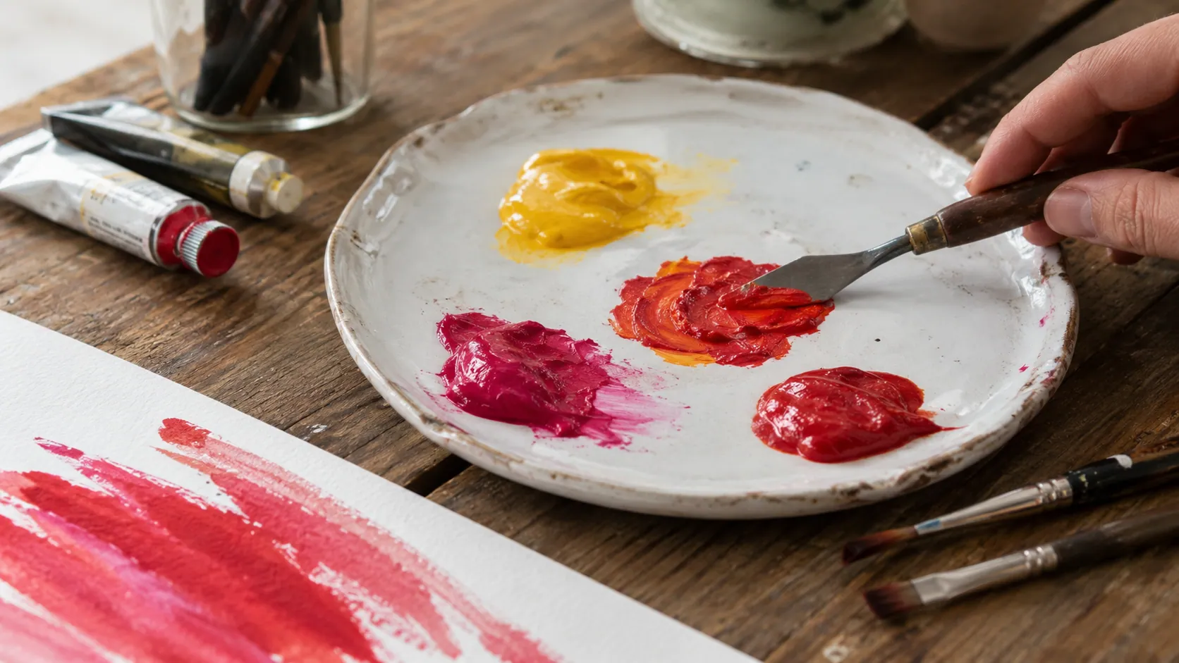
How to Make Red Paint
If your goal is how to make red paint, start with the right expectation. You usually cannot create a clean, pure red by mixing random colours like orange, purple, brown, or pink. Instead, choose a red or magenta-based pigment and adjust it.
For a bright red-like paint, try mixing quinacridone magenta or permanent rose with a clear yellow such as cadmium yellow or transparent yellow. Some artists use mixes like Permanent Rose 502 and Transparent Yellow 653 to create strong red tones, depending on the paint brand and pigment strength.
For acrylics, mix on a palette and test on white paper. Acrylic paint often dries slightly darker, so check the dry result before adding more colour. For watercolor, use transparent layers instead of thick mixing. Watercolor red can become dull if too many pigments are blended. For oil paint, red mixtures stay workable longer, giving you more time to adjust warmth and depth.
If you are a beginner, the best practical advice is simple: buy one strong warm red and one cool red. A warm red can help make scarlet, orange-red, and coral red. A cool red can help make crimson, burgundy, wine red, and raspberry red.
How to Make Dark Red, Light Red, and Bright Red
To make dark red, start with red and add a tiny amount of black, brown, dark blue, or purple. Black makes red darker quickly, but too much can make it look lifeless. Brown creates a warmer dark red, useful for brick red, rust red, terracotta red, and maroon. Blue creates cooler dark reds like wine red, burgundy, and oxblood red.
To make light red, add white to red. This creates a tint, often called pink. If you want a light red that still feels warm, add a little yellow or coral. If you add too much white, the colour loses intensity and becomes pastel.
To make bright red, avoid overmixing. Use a clean, strong red pigment. If the red looks too cool, add a tiny amount of yellow. If it looks too orange, add a tiny amount of magenta or cool red. Bright red depends on saturation, so avoid adding black, gray, brown, or green unless you want a muted result.
A useful mini case study: imagine a student trying to paint a bright apple. They mix red with black to create shadow, but the apple becomes muddy. A better method is to keep the main apple area bright red, then use a deeper cool red or burgundy only in the shadow. This keeps the apple looking fresh instead of dirty.
How to Make Popular Red Shades
Different red shades need different colour choices. Here are the most useful formulas.
How to Make Crimson
Crimson is a deep, cool red. Start with red and add a small amount of blue, magenta, or alizarin crimson. Do not add too much blue, or the colour will turn purple. Crimson works well for flowers, fabric, lipstick tones, and dramatic artwork.
How to Make Scarlet
Scarlet is a warm, bright red with a slight orange undertone. Mix red with a tiny amount of yellow. A warm red pigment like cadmium red already leans toward scarlet. Scarlet is useful for bold signs, costumes, sports graphics, and bright craft projects.
How to Make Burgundy
Burgundy is a dark wine red. Mix red with a little blue and then add a very small amount of brown or black. For a richer burgundy, use a cool red base like quinacridone red or alizarin crimson.
How to Make Maroon
Maroon is darker and earthier than burgundy. Mix red with brown or a small amount of dark blue. You can add a tiny amount of black for depth, but use it carefully. Too much black will flatten the colour.
How to Make Cherry Red
Cherry red is bright, clean, and slightly sweet-looking. Start with a vivid red and add only a very small amount of magenta if it needs more richness. Avoid brown, black, or green.
How to Make Brick Red or Rust Red
Brick red and rust red are warm, earthy reds. Mix red with brown, orange, or burnt umber. Add a little yellow ochre for a dusty, clay-like effect. These shades are useful for walls, rooftops, pottery, old buildings, and natural landscapes.
How to Make Red Food Coloring, Icing, or Frosting
Making red food coloring, red icing, or red frosting is different from mixing paint. For baking, you usually need a strong gel food coloring rather than liquid food coloring. Liquid colour can thin buttercream or icing, while gel colour gives a deeper result with less product.
To make bright red frosting, start with white buttercream and add red gel food coloring gradually. Deep red often looks stronger after resting for a few hours, so do not keep adding colour too fast. For deep red buttercream, a tiny amount of brown or burgundy gel can help. For maroon frosting or burgundy icing, add a small amount of blue, brown, or black to red.
For fondant, gel or paste colours work better than liquid. Knead the colour evenly and allow time for it to deepen. Food colour results depend on the base: butter, cream cheese, and vanilla frosting can slightly warm or dull the final red.
The same rule applies here as in paint: add darker colours slowly. A tiny bit can help; too much can ruin the red.
Red in Digital Design: HEX, RGB, CMYK, and HSL Codes
In digital design, red is much easier to define because it uses numbers. The most common pure red code is #FF0000. In RGB, this is written as RGB 255, 0, 0 or R=255 G=0 B=0. That means the red channel is fully on, while green and blue are off.
For printing, red is often represented as CMYK 0, 100, 100, 0. This means no cyan, full magenta, full yellow, and no black. In HSL, a standard red can be written as HSL 0°, 100%, 50%.
| Format | Red Code |
| HEX | #FF0000 |
| RGB | 255, 0, 0 |
| CMYK | 0, 100, 100, 0 |
| HSL | 0°, 100%, 50% |
These codes are useful for CSS, HTML color code, Canva, Photoshop, Adobe Illustrator, Procreate, web design, digital art, graphic design, and print design. Just remember that screen red and printed red may not look exactly the same because screens use light, while printers use ink.
Why Your Red Mix Looks Brown, Orange, Pink, or Purple
If your red mix looks wrong, the problem is usually colour bias. Every pigment has an undertone. Some reds lean warm, some lean cool, and some are already slightly muted.
If your red looks brown or muddy, you may have added too much black, green, brown, or too many colours at once. To fix muddy red paint, start again with a cleaner red and add dark colours slowly.
If your red looks orange, you probably added too much yellow or started with a warm red. Add a tiny amount of magenta or cool red to pull it back.
If your red looks pink, there is too much white or the pigment is weak. Add more red pigment or a small amount of magenta to increase saturation.
If your red looks purple, you added too much blue. Add a little warm red or yellow to balance it, but do this carefully so it does not become brown.
The best fix is prevention: use fewer colours, mix in small amounts, and test before committing.
Best Beginner Tips for Mixing Red Successfully
The easiest way to mix red successfully is to keep your colour recipe simple. Start with a strong red pigment whenever possible. If you are trying magenta + yellow, use clean, bright versions of both colours. Dirty or muted pigments will create a dull red.
Avoid adding black too early. Black can make red darker, but it can also kill the brightness. For a richer dark red, try brown, dark blue, or a deeper red first. If you need a softer red, use white carefully because it quickly turns red into pink.
Keep a small colour notebook. Write down the colours you mixed, the rough ratio, and how the colour looked after drying. This is especially helpful for acrylic paint, watercolor, gouache, icing, and digital palettes.
A professional artist might say:
“Colour mixing is less about guessing and more about testing small changes.”
That is the best mindset. Red is powerful, but it is also sensitive. Small changes create big shifts.
Common Myths About Making Red
One common myth is that any two colours can make red. In traditional paint, this is not true. Red is usually treated as a primary colour, so you need a red or magenta-based pigment to get a clean result.
Another myth is that black is the best way to make dark red. Black can work, but too much makes red look flat or muddy. Brown, blue, purple, or a deeper red often create richer results.
Some people also think RGB and paint mixing work the same way. They do not. RGB is based on light. RYB and paint mixing are based on pigment. CMYK is based on printing inks. That is why red can be a primary colour in one system and a mixed colour in another.
Finally, magenta and yellow do not always make perfect red in every medium. The result depends on pigment quality, transparency, opacity, and the exact colours used.
FAQ
What two colours make red?
In traditional paint, no two basic colours usually make pure red because red is a primary colour. In CMYK-style mixing, magenta and yellow can create red.
Can you make red without red paint?
You can sometimes make a red-like colour with magenta + yellow, but for clean red paint, it is usually better to start with a red pigment.
Do magenta and yellow make red?
Yes, magenta and yellow make red in CMYK and some subtractive pigment systems. In basic RYB paint theory, red is treated as a primary colour.
What colours make dark red?
To make dark red, mix red with a tiny amount of black, brown, blue, or purple. Brown creates warmer dark red, while blue creates cooler wine-like red.
What colours make burgundy?
To make burgundy, mix red with a small amount of blue, then add a tiny touch of brown or black for depth.
What colours make maroon?
To make maroon, mix red with brown or a small amount of dark blue. Add black only if you need a much deeper shade.
What is the HEX code for red?
The standard red hex color code is #FF0000.
What is the RGB code for red?
The standard red RGB code is RGB 255, 0, 0.
Why can’t I make red from other paint colours?
Because in traditional paint theory, red is a primary colour. Mixing other pigments often creates dull, brown, or muddy colours instead of pure red.
Conclusion:
So, what colours make red? In traditional paint mixing, pure red is usually not made by mixing two other colours because red is a primary colour. In CMYK and some subtractive systems, magenta and yellow make red or a strong red-like colour. In digital design, red is created with RGB 255, 0, 0 or #FF0000.
For most practical projects, the better question is not only how to make red, but how to make the right red shade. You can create dark red, light red, bright red, crimson, scarlet, burgundy, maroon, cherry red, brick red, and rust red by starting with a good red pigment and adjusting it carefully.
Disclaimer:
This article is for general educational and creative guidance only. Color-mixing results may vary depending on the type of paint, pigment quality, brand, surface, lighting, printer settings, digital screen calibration, or food coloring used. Always test a small amount first before applying the final color to artwork, crafts, frosting, fabric, walls, or design projects.